Takamul — Website Redesign
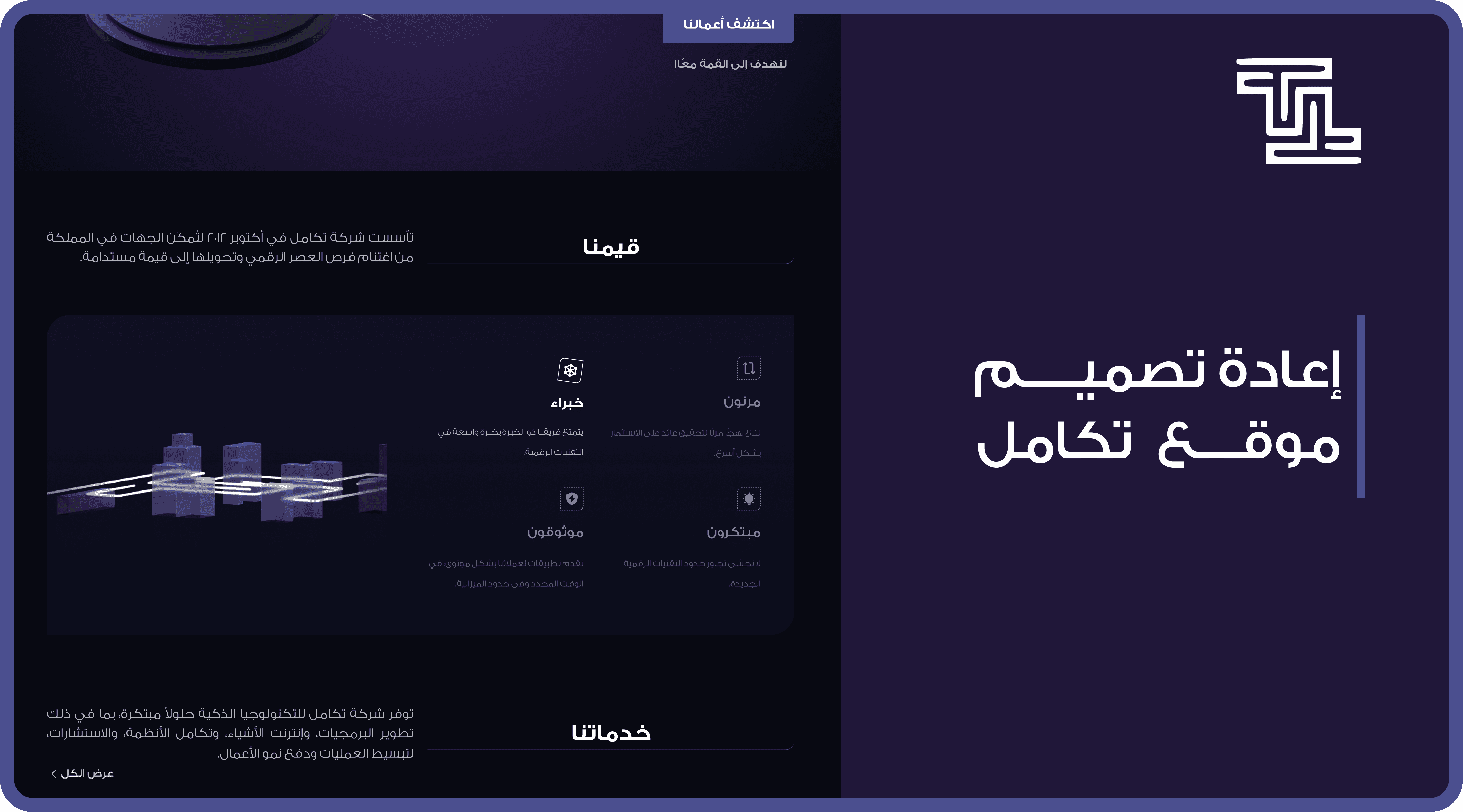
A website redesign task focused on improving clarity, hierarchy, and user flow while maintaining the company’s visual identity.
Web Design
UI Challenge
UI/UX Designer
#Tech-B2B
PROJECT DETAILS
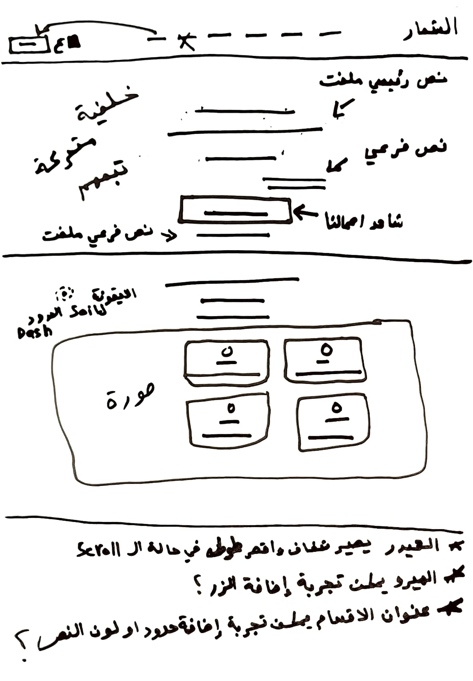
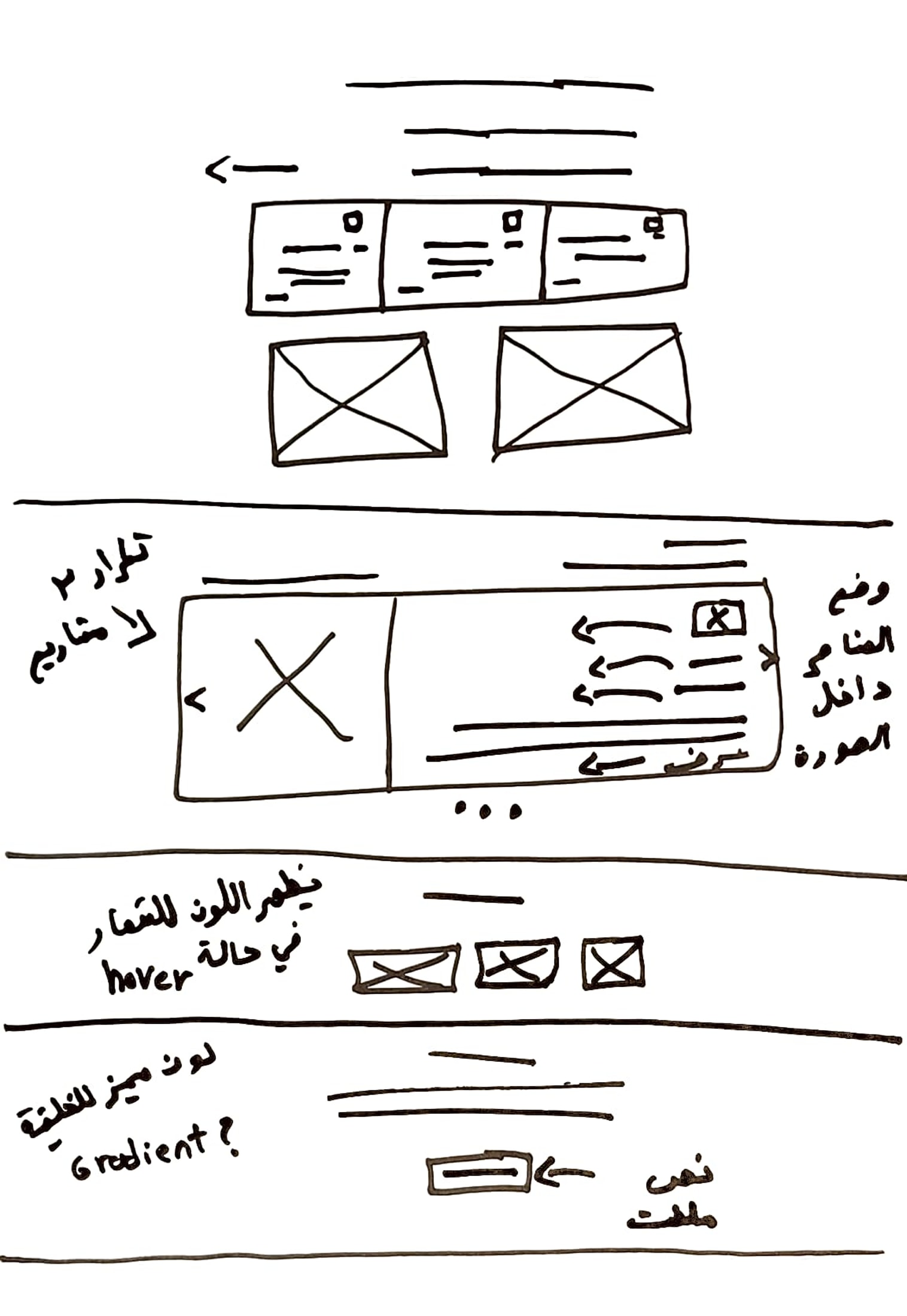
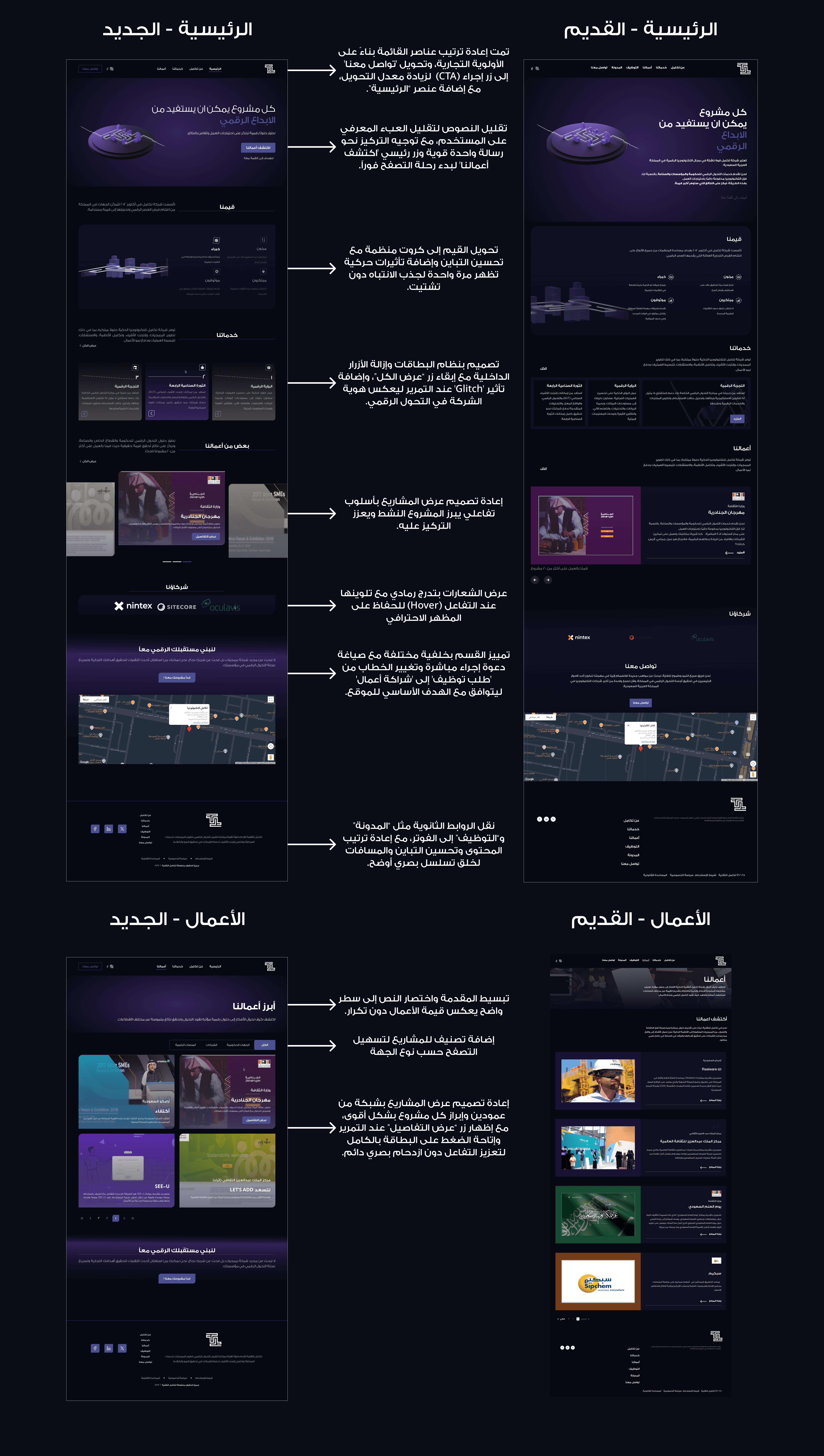
The homepage prioritized visual impact over clarity — the hero section lacked a direct CTA path, services were displayed as undifferentiated cards, and projects had no filtering system. Users had no clear next step.
Restructured the hero to lead with a single primary CTA. Converted the values section into animated cards to reduce text density. Added a Glitch hover effect on services to reinforce the digital transformation identity. Redesigned project display with category filtering and a persistent hover reveal. Improved footer hierarchy and contrast throughout.