Jarir Bookstore App — UX/UI Redesign
A comprehensive UX/UI redesign of the Jarir Bookstore mobile app. The primary objective was to resolve navigation friction, optimize product discoverability across a massive inventory, and streamline a lengthy checkout process.
App Design
Redesign Concept
UX/UI Designer
#E-commerce

PROJECT DETAILS
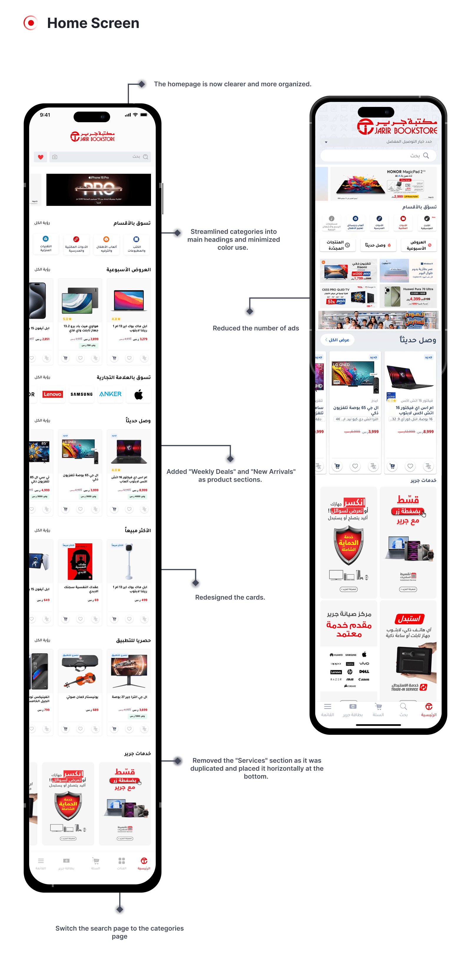
The app struggled to present Jarir's wide product range clearly. Category structure was disorganized, browsing required too many steps, and the checkout flow introduced unnecessary friction — leading to a fragmented shopping experience.
The team followed a full Design Thinking process: user interviews and an affinity map identified core pain points, competitive analysis shaped structural decisions, and Crazy 8's sessions explored layout alternatives. The final direction restructured the category hierarchy, simplified navigation, and reduced checkout steps — then validated the changes through A/B testing.
The Challenge
Despite being one of Saudi Arabia’s largest retail chains, the Jarir app’s user experience was fragmented. Users struggled to navigate disorganized categories and were overwhelmed by repetitive product listings (e.g., different colors of the same device listed as entirely separate products). Furthermore, the checkout process introduced unnecessary friction, leading to potential drop-offs.
Our initial heuristic evaluation and competitive analysis revealed a critical metric: completing an order on the Jarir app took 7 steps, compared to the industry standard of 6 steps found in competitors.

Research & Discovery
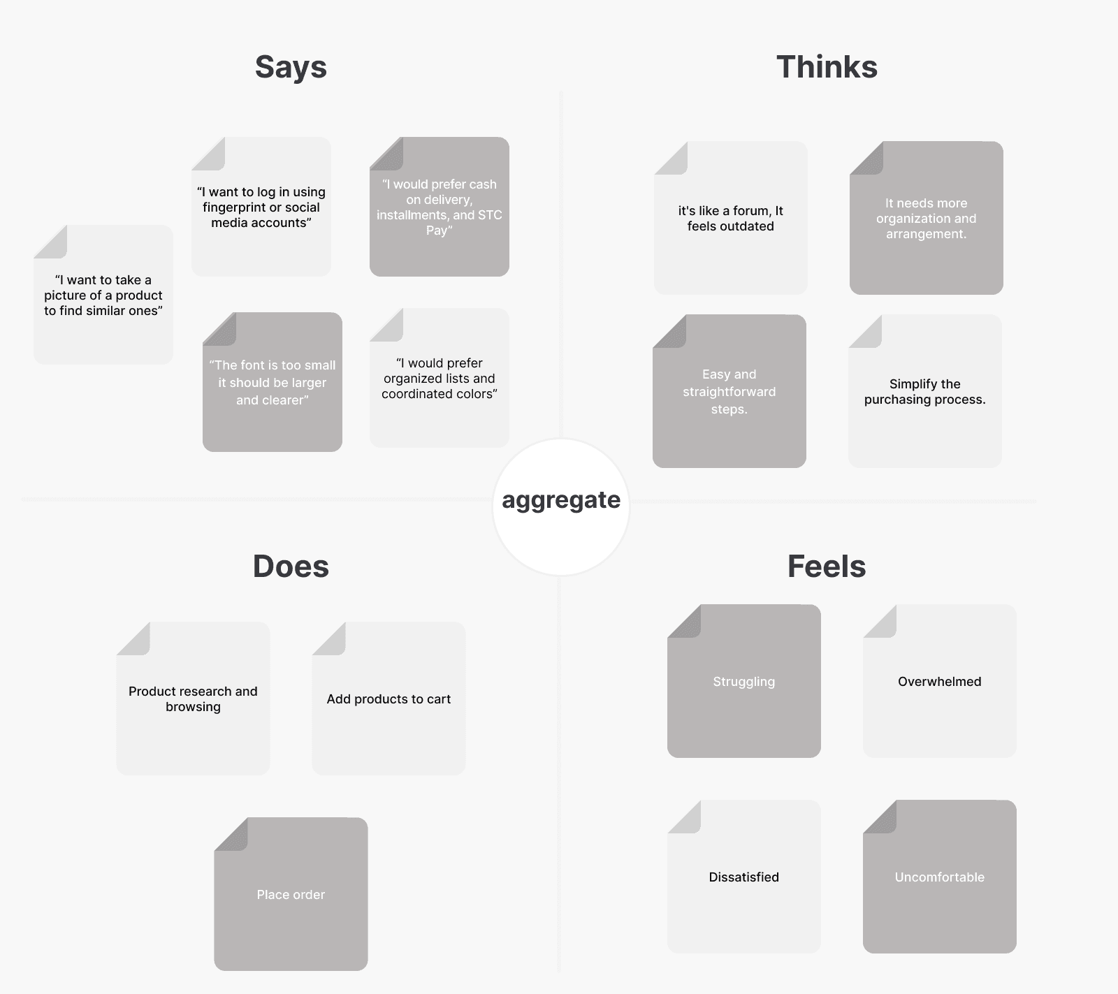
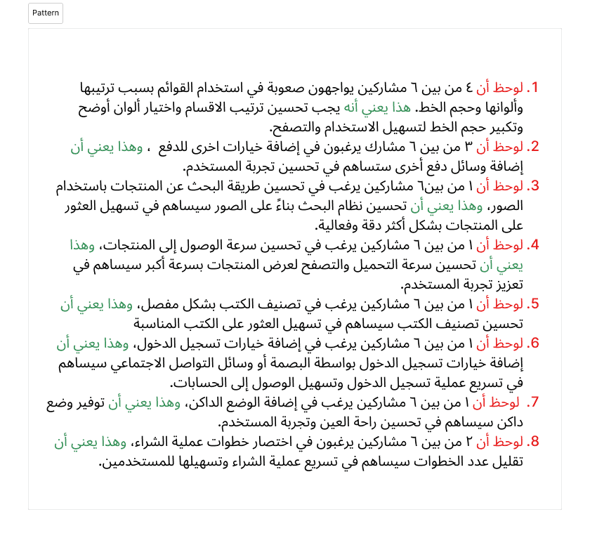
Listening to the Users: To validate our assumptions, we conducted 1-on-1 interviews with 6 active users. We mapped their responses using an Empathy Map to identify core pain points.
Key Insights:
Variant Clutter: Users found it frustrating to scroll through identical items differing only by color or storage capacity. They expected a single product page with variant selectors.
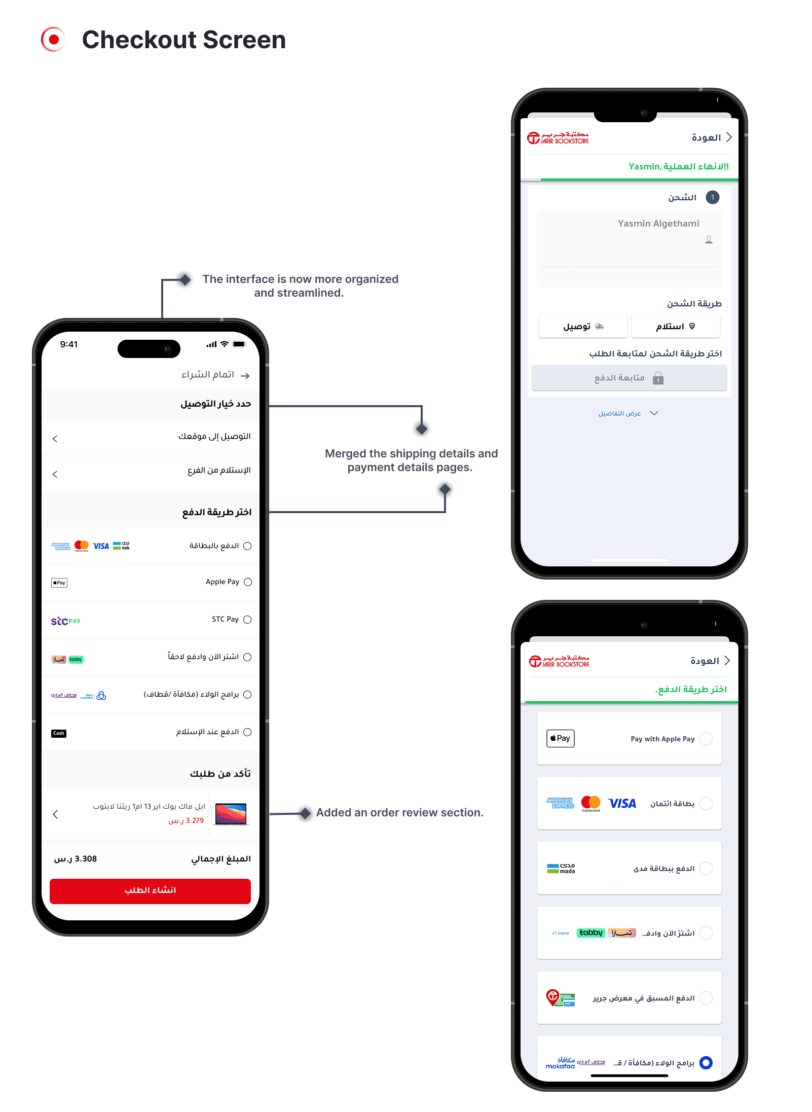
Checkout Friction: The payment flow was perceived as tedious. Users explicitly requested modern payment integrations like STC Bank and Apple Pay, alongside a guest checkout option.
Visual Overload: The interface felt outdated and cluttered, lacking visual hierarchy, making it difficult to locate essential product details quickly.
Ideation & Information Architecture
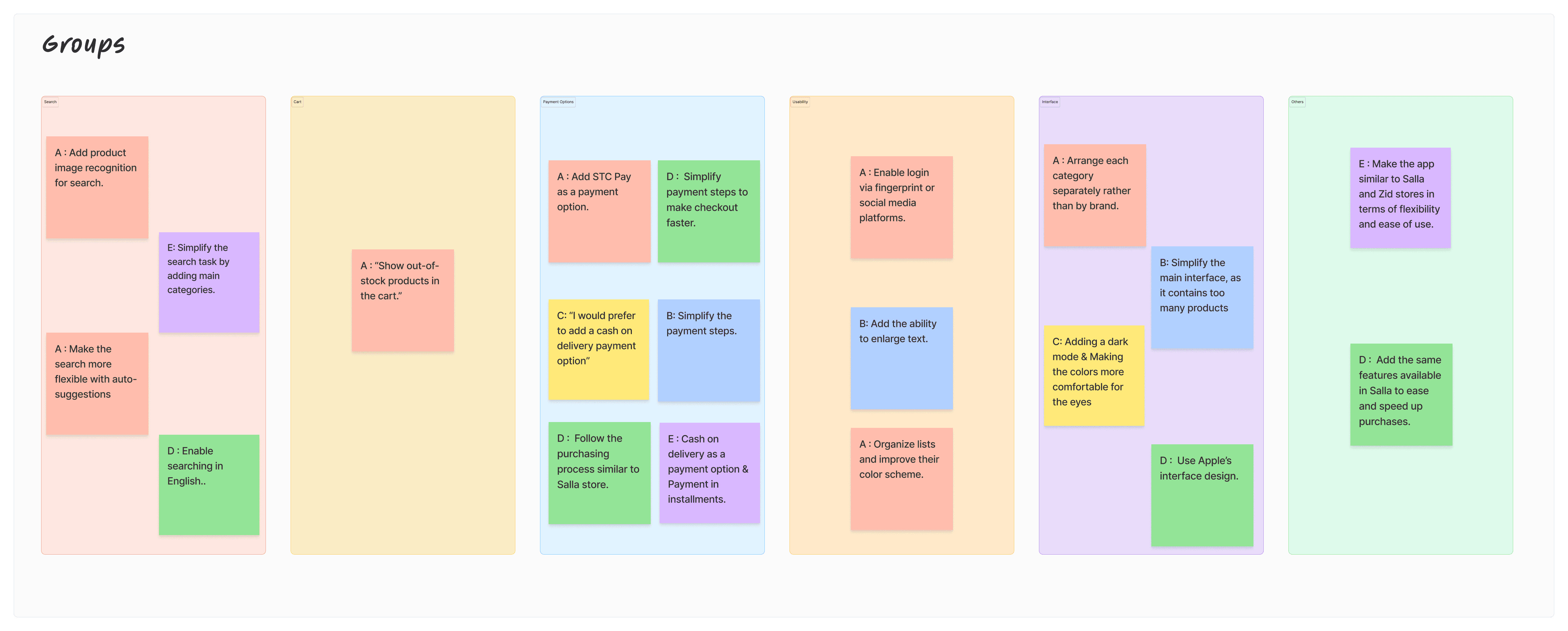
Structuring the Solution: We synthesized our research findings using Affinity Mapping, categorizing user feedback into actionable themes: Usability, Interface, Search, and Payment Options.
To address the cluttered listings, we redefined the Information Architecture (IA). We proposed grouping product variants under single master listings and restructured the category hierarchy to be more intuitive.

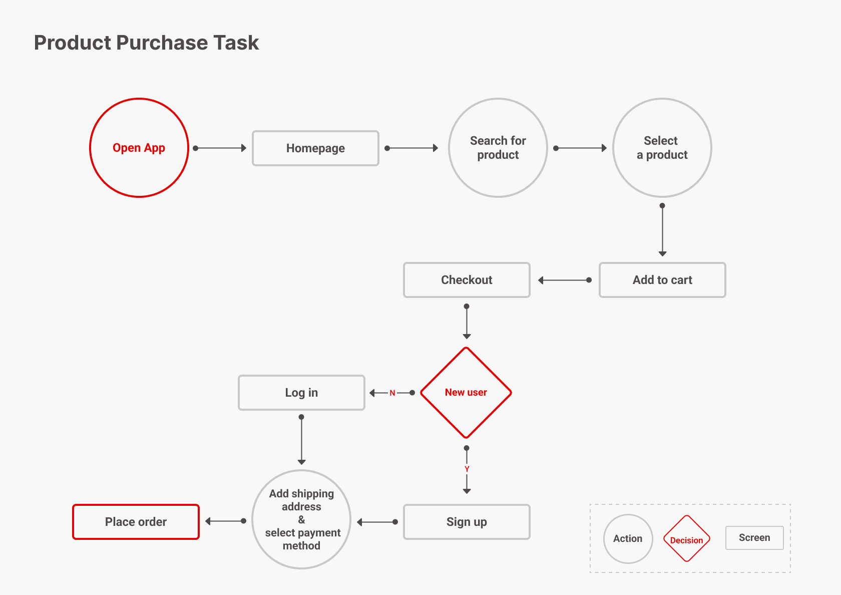
We then mapped a new, streamlined User Flow that reduced the checkout process by eliminating redundant screens and integrating auto-suggestions for search and faster payment gateways.
Design Execution
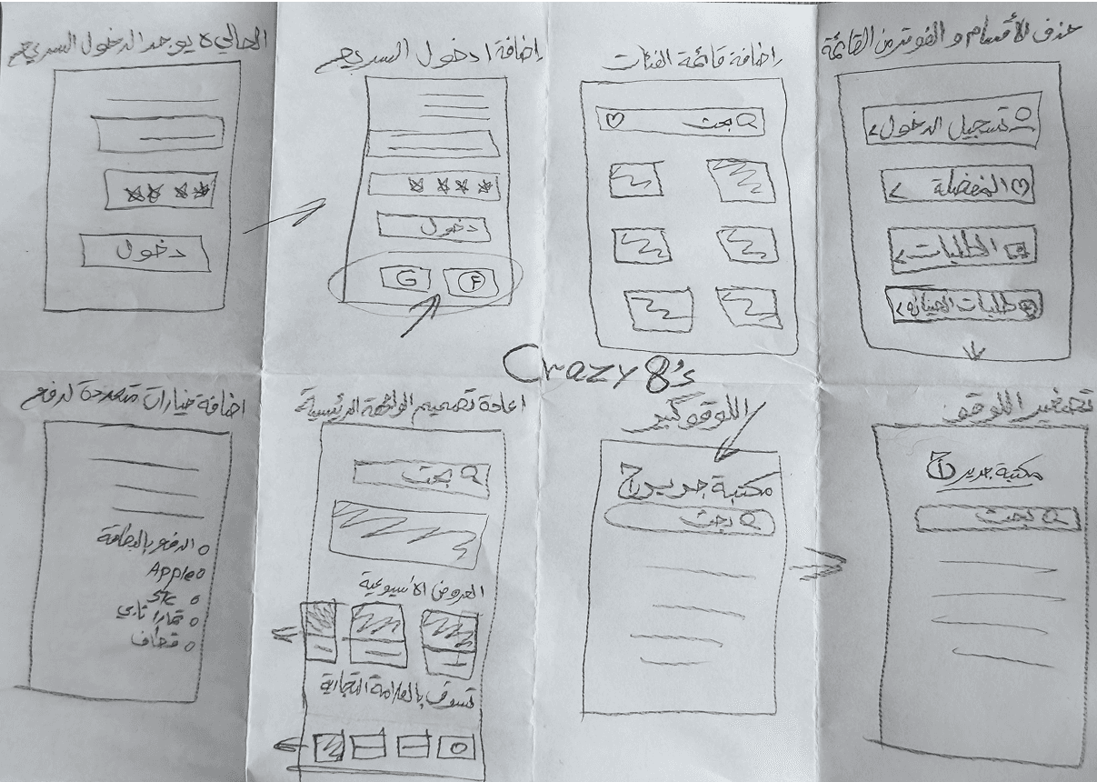
We generated rapid layout concepts using the Crazy 8’s method before committing to digital wireframes.
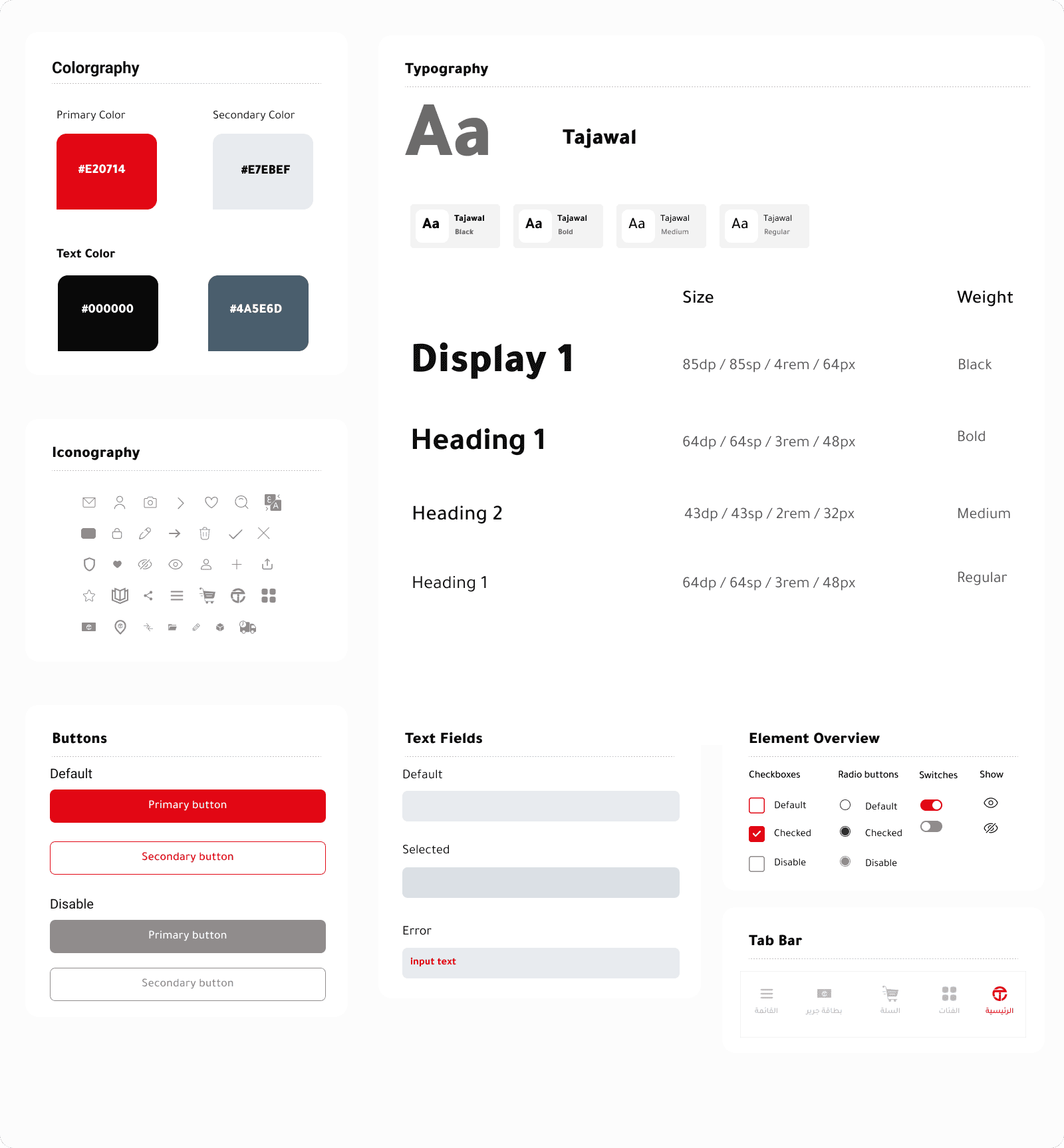
To ensure consistency, we established a localized Design System. We selected the “Tajawal” typeface for its high legibility in Arabic UI, standardized the primary brand colors (Jarir Red),
Validation & Outcomes
We validated our high-fidelity prototypes through A/B testing, comparing the original app flow with our redesigned screens
The Impact:
Reduced Cognitive Load: Grouping product variants cleaned up the search results significantly, allowing users to find what they needed faster.
Streamlined Checkout: The optimized cart and checkout screens reduced task completion time and minimized friction points.
Enhanced Visual Hierarchy: The new, organized interface successfully directed user focus to key actions (Add to Cart, Checkout) without visual distraction.