Ulom Ray — UX Design & Audit
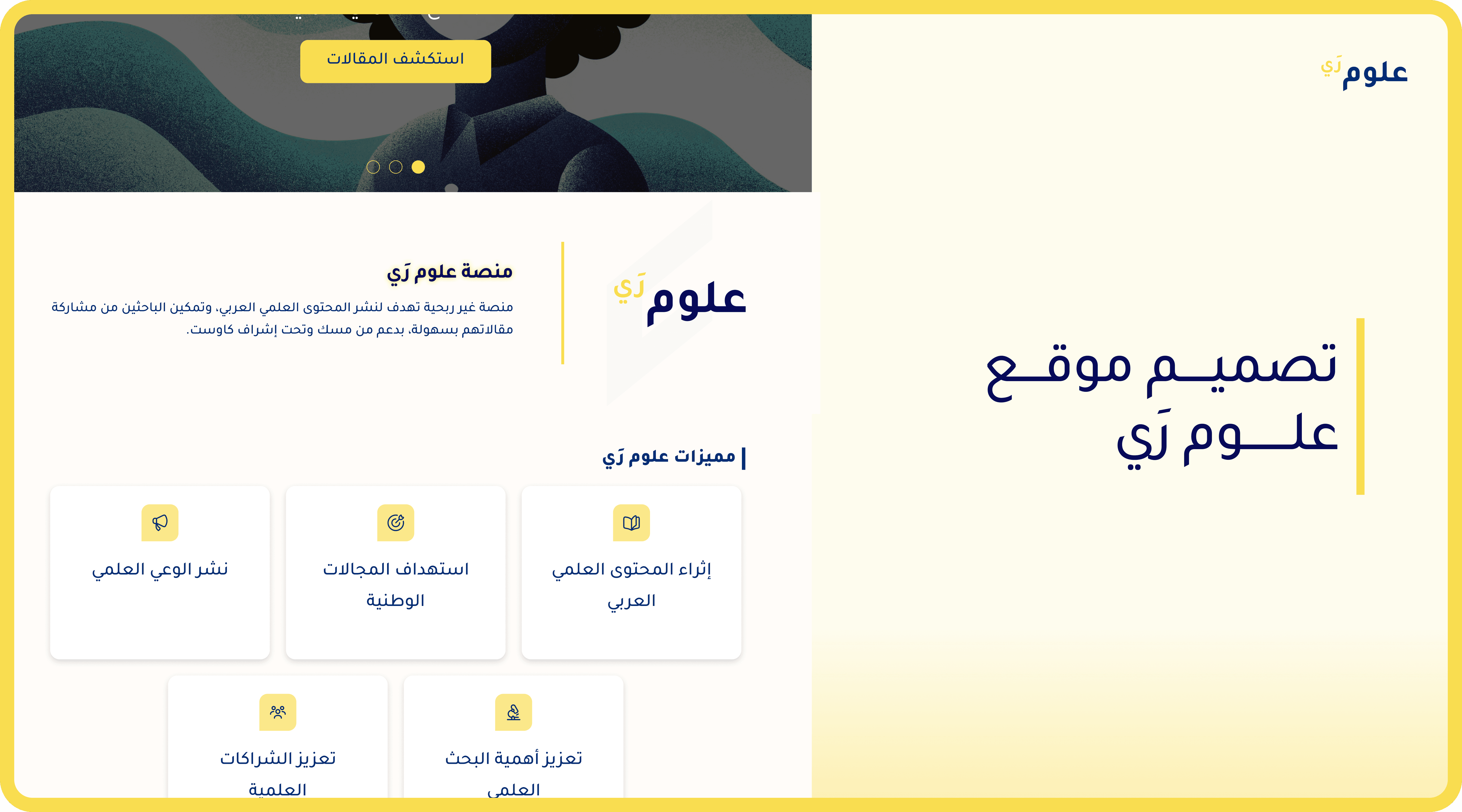
A non-profit platform focused on enriching Arabic scientific content. I contributed to UX wireframes, visual identity, and a comprehensive 13-page heuristic evaluation of the live product.
Responsive Web
UX Audit
UX/UI Designer
#Non-Profit
PROJECT DETAILS
The platform launched with several UX gaps: unclear hero messaging, broken RTL alignment in article cards, non-interactive navigation elements, and form fields missing placeholders and error guidance — all reducing usability for researchers and readers.
Business Goals & Information Architecture
The core objective of Ulom Ray was to build an accessible, user-friendly hub for researchers and readers. Key business requirements included a seamless registration process, an engaging daily newsletter system, and an intuitive article-reading experience.
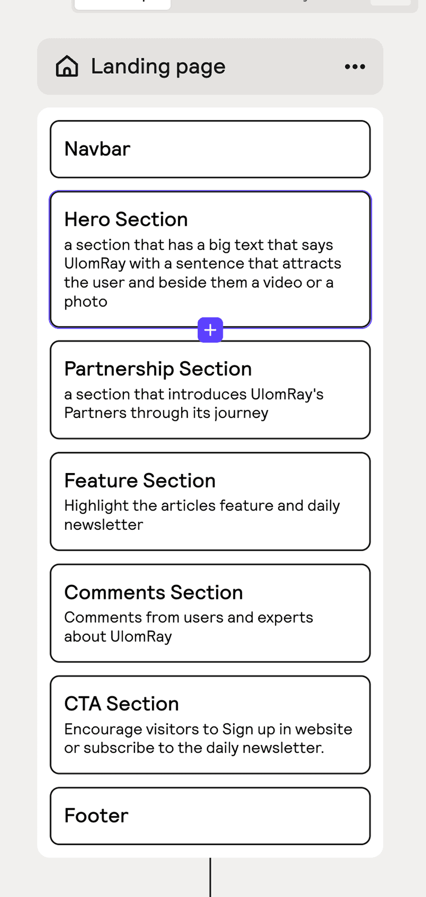
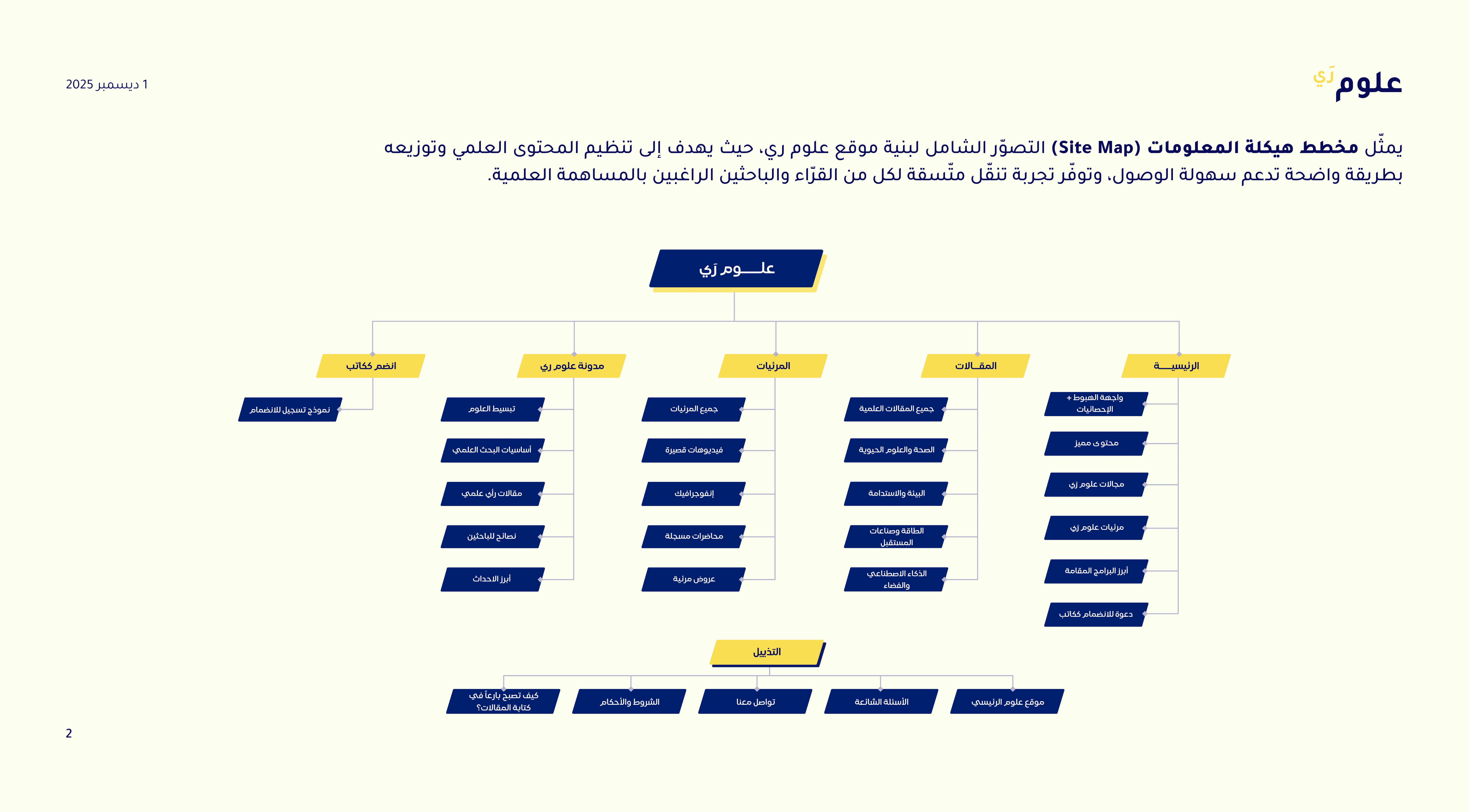
The platform’s foundation was laid out through a comprehensive Site Map. For the primary Landing Page, a strategic wireframe was constructed to guide the user journey.
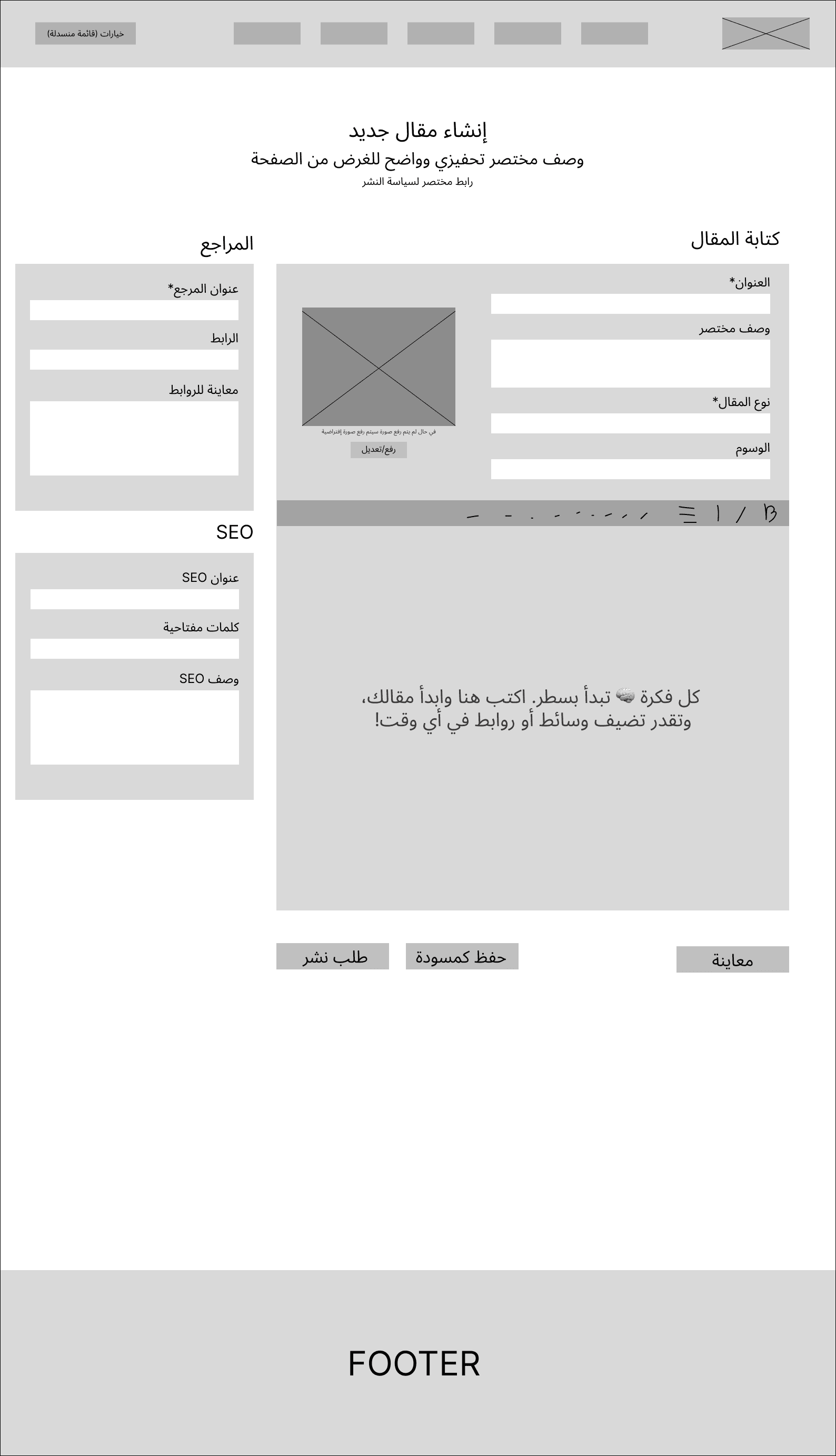
Additionally, low-fidelity wireframes were mapped for critical backend processes, such as the Article Creation flow for authors.
Visual Execution
A Mood Board was developed to establish a trustworthy visual identity, utilizing deep blues and clean typography to reduce cognitive load during long reading sessions.

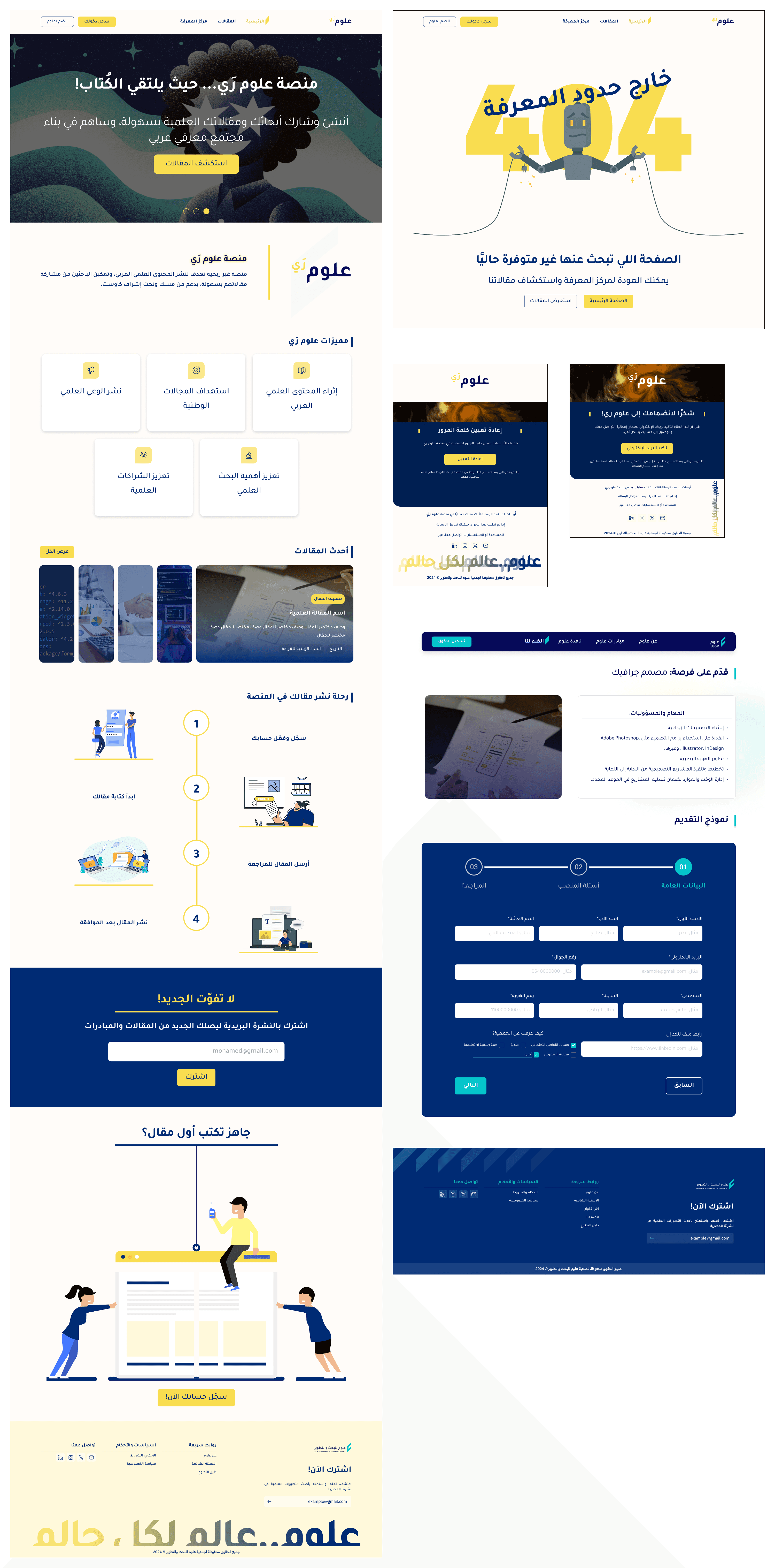
High-Fidelity Delivery include:
A fully responsive Landing Page.
Engaging 404 Error pages.
Transactional email templates.
A clear design form template for applying for an opportunity
Post-Launch Heuristic Audit
After the initial version of the platform was launched, a gap was identified between the design intent and the technical implementation. To resolve this, a systematic Heuristic Evaluation was conducted across 13 live pages.
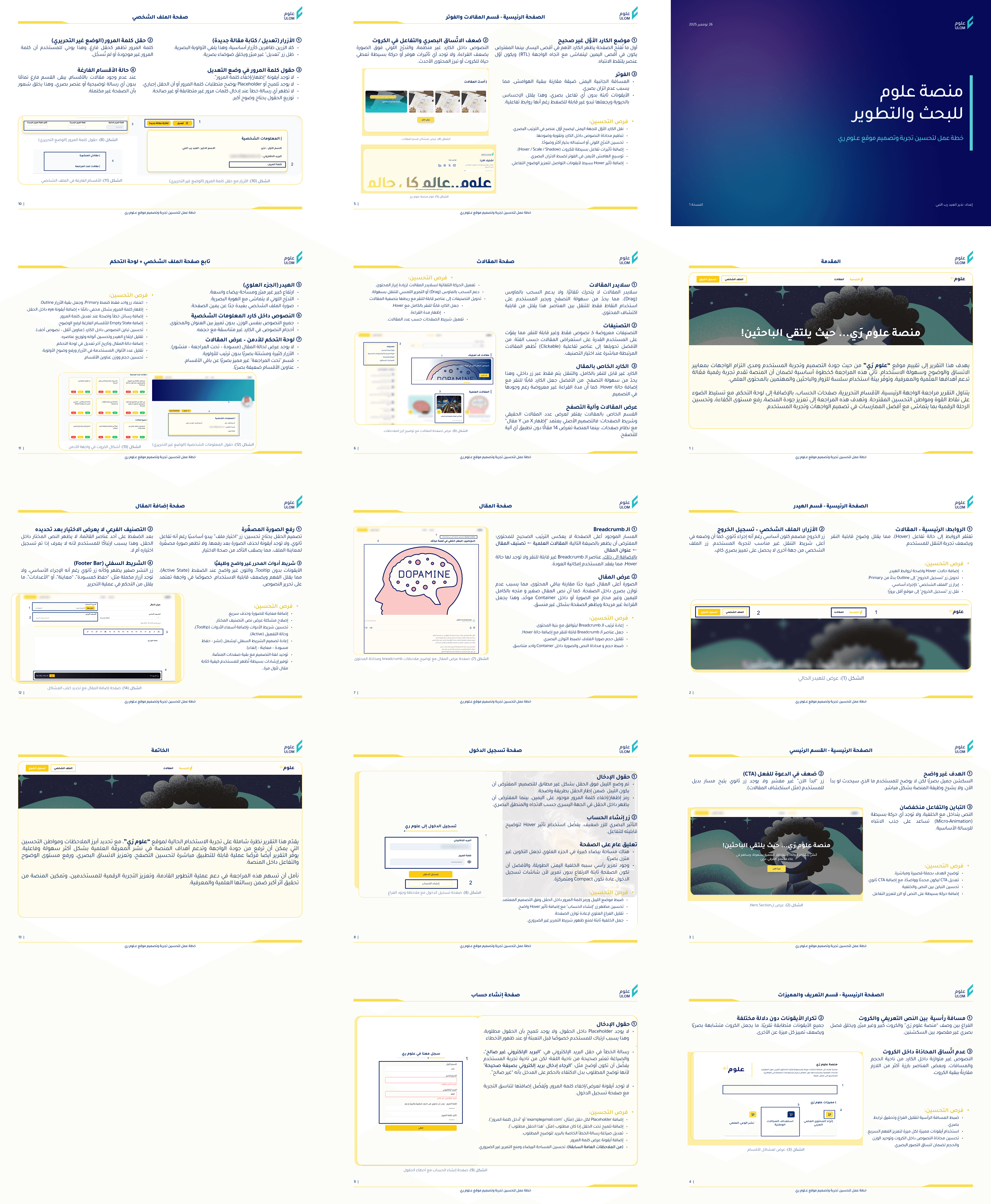
Instead of merely pointing out errors, the audit provided prioritized, developer-ready recommendations for each issue, ensuring the engineering team could systematically resolve the usability gaps and improve the overall platform metrics.